https://fstoppers.com/education/ultimate-guide-composition-part-two-beyond-basics-32902
The Ultimate Guide to Composition - Part One: Just Say "No"keh


Note: This is Part One. For Part Two: Beyond the Basics, click here.
Composition – it’s perhaps one of the most important elements of photography. And with today’s technological marvels in lenses, it’s an even easier thing to forget – especially when bokehliciousis is so much more fun to talk about. Your composition is how you see – and that makes it infinitely more important than how out of focus the background is.
Obsession with bokeh is bad for your photography. There. I said it. I know it's not a popular opinion when there are a lot of people out there that drool over this very thing. Bokeh not only lets you obsess about something pretty insignificant, but it oftentimes makes for lazy composition. Henri Cartier-Bresson, Richard Avedon, William Eggleston, Alfred Eisenstaedt. These were not photographers obsessed with the shallowest depths of fields – these were iconic photographers capable of producing iconic photographs built on the foundations of masterful compositions and superb timing. Forget f/1.2. Think about what's around you, and use that to build a better photograph.
Keep in mind that these compositional “rules” are really just “guides” and don’t need to be followed to exacting precision (or sometimes even at all). Not every rule of composition can work well with every scene. Overall, composition helps to bring balance. And remember, as Tony Roslund says, the most important thing is talent. “All the other stuff is great, but it won’t help an otherwise shitty image.”
 Center Composition
Let’s begin with the most obvious type of composition – center composition. If one were to hand a camera to an aunt, and ask her to take a picture, she would most likely photograph the subject in the center of the frame. Center composition places the important thing in the middle. When it’s done well, it excels in the use of symmetry. Center composition is like roasting a chicken. It’s easy to do, but it’s hard to do really well.
 For truly great examples of center compositions, we refer to Wes Anderson.
Center compositions can be broken down even farther than the overall objects and can use the position of things like facial features to actually indicate the next rule…
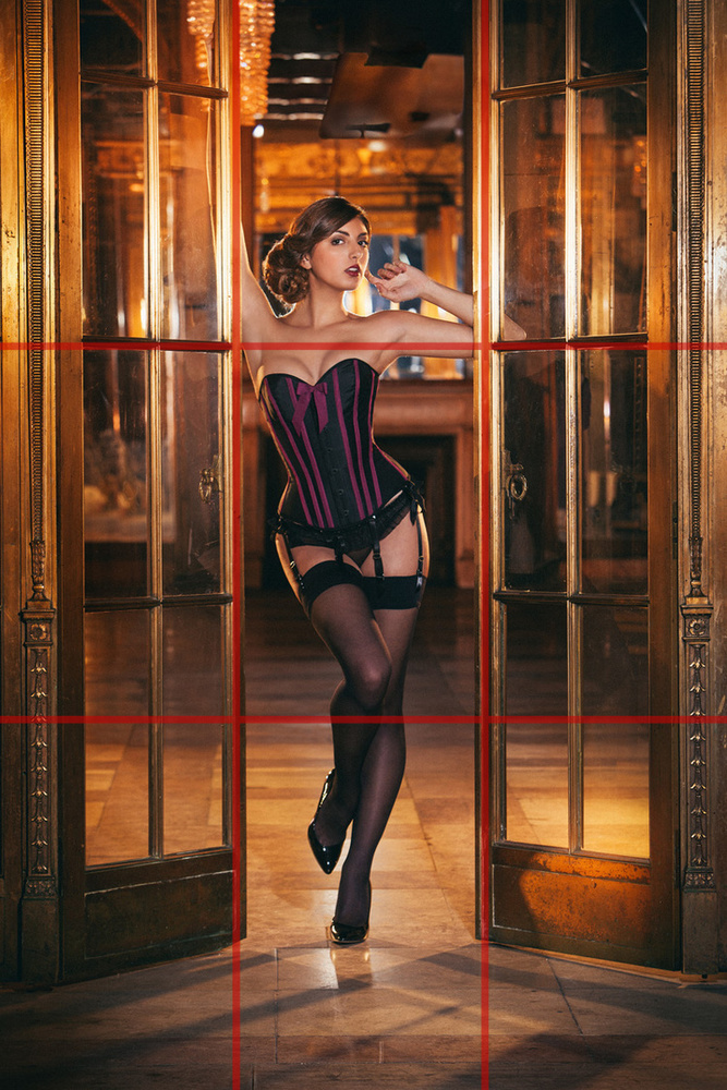
 Rule of Thirds
Once we learn a thing or two about composition, we start to use this. This is the first of the photographer’s “Golden Rules.” The Rule of Thirds says that an image should be divided into nine equal parts by two evenly spaced vertical and two evenly spaced horizontal lines. Important compositional elements should be along these lines or at intersections. These intersections are called “eyes.” A person’s closest eye to the camera should be placed at one of these intersections.
 Using
an off-center composition creates more tension and visual interest than
a typical center composition would. These compositions can be basic
with only one subject….
Using
an off-center composition creates more tension and visual interest than
a typical center composition would. These compositions can be basic
with only one subject….
 …or they can be much more complex, using multiple intersections and lines to draw the viewers eyes around the image.
 Golden Triangles
This rule works by having strong diagonal lines pass through the image, dividing it into three (or four) triangles. The strongest line (called a major line) divides and dominates the image diagonally. Then, from one corner, an intersecting line connects to the diagonal line perpendicularly (this is called a reciprocal line).
 In some cases, a third line extends from the opposite corner creating another reciprocal line.
 The resulting triangles all have the same ratios – also know as golden (explained much more in depth below).
This works really well on images with perspective or strong
architectural elements, but it also works well when wanting the subject
to fill the entire frame. Putting elements of composition on a diagonal
plane gives them a more dynamic presence.
The resulting triangles all have the same ratios – also know as golden (explained much more in depth below).
This works really well on images with perspective or strong
architectural elements, but it also works well when wanting the subject
to fill the entire frame. Putting elements of composition on a diagonal
plane gives them a more dynamic presence.
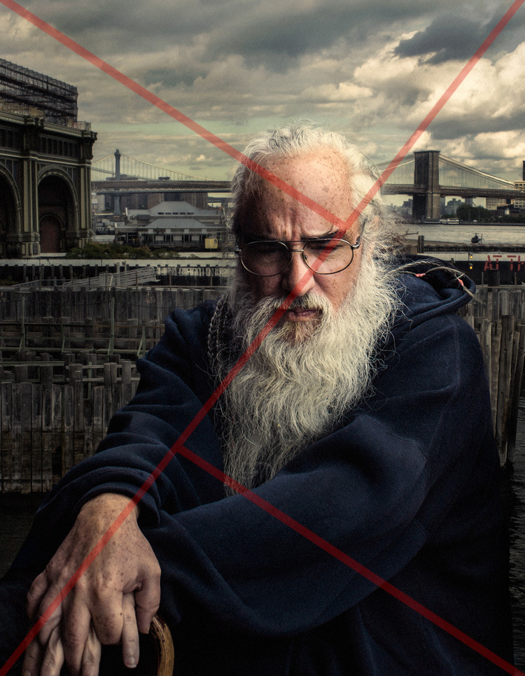
 The Diagonals (Baroque and Sinister Diagonals)
One of the best things a photographer can do is study paintings and art history. Beyond the study of light, color palettes, color theory and the fact that it was the dominant visual medium for tens of thousands of years, studying great painters is the key to expert composition. When everything in a scene must be methodically arranged and obsessed over and placed just so in the frame, we are able to begin to understand why things are placed how they are. One of the more common compositions in art (do in large part to the boom of this style during the Baroque period) is using diagonal lines.
 There are two predominant kinds of diagonals – “Baroque” and
“Sinister”. Baroque Diagonals are read from left to right and Sinister
Diagonals are read from right to left. One can only assume that this is
an allusion to the notion that lefties burn in hell. In an amazing read
by Adam Marelli, he breaks down the work of Alfred Eisenstaedt by using
this “Sinister” composition of ballerinas.
There are two predominant kinds of diagonals – “Baroque” and
“Sinister”. Baroque Diagonals are read from left to right and Sinister
Diagonals are read from right to left. One can only assume that this is
an allusion to the notion that lefties burn in hell. In an amazing read
by Adam Marelli, he breaks down the work of Alfred Eisenstaedt by using
this “Sinister” composition of ballerinas.
 We notice the ballerina on the left (her face is at the eye and the
only face visible – therefore she is the subject), looking to the right,
drawing our eye in that direction across the image, creating the
diagonal, and lining up with other important compositional elements
(like the pointed toe). Read a much more comprehensive breakdown of
Eisenstaedt’s work on Adam Marelli’s blog.
We notice the ballerina on the left (her face is at the eye and the
only face visible – therefore she is the subject), looking to the right,
drawing our eye in that direction across the image, creating the
diagonal, and lining up with other important compositional elements
(like the pointed toe). Read a much more comprehensive breakdown of
Eisenstaedt’s work on Adam Marelli’s blog.
 Golden Ratio / Golden Rectangles / Golden Spiral
Classic thinkers from Plato to Pythagoras to Kepler believed that geometry is a powerful underpinning of the cosmos. Plato supposedly even said, “God geometricizes continually.” Leonardo da Vinci had an obsession with proportions – creating large areas of his work around the exact proportions of the Golden Ratio. So did Salvador Dali. As this particular rule of composition is a little complex, let’s break it down.
 -The Golden Ratio describes an aesthetically pleasing proportion
where the largest shape is divided by a perfect square, and the
resulting rectangle is in exact proportion to the original one – all the
way down the drain. This, subsequently, results in a sort of spiral
(more on that below).
-The Golden Ratio describes an aesthetically pleasing proportion
where the largest shape is divided by a perfect square, and the
resulting rectangle is in exact proportion to the original one – all the
way down the drain. This, subsequently, results in a sort of spiral
(more on that below).
 -The Golden Ratio is best explained using the Fibonacci Sequence (0,
1, 1, 2, 3, 5, 8, 13, …) where each number is the sum of the previous
two. The actual formula for the ratio is:
-The Golden Ratio is best explained using the Fibonacci Sequence (0,
1, 1, 2, 3, 5, 8, 13, …) where each number is the sum of the previous
two. The actual formula for the ratio is:
 Algebraically, this is shown as:
 This results in the number 1.618 (approximately). This is like rounding Pi to 3.14, but this number is called Phi. Using this number helps to illustrate the ratio.
 Imagine this rectangle has a width of 1 and length of 1.618. When we
divide this up using the Golden Ratio, the result is that every square
would have a 1:1 ratio and the leftover rectangle would always be
1:1.618. This method isn’t limited to rectangles and squares though. It
also works on circles, triangles, pyramids and various other geometric
forms. Theothiuacan (the pyramids of Mexico) as well as the Great
Pyramids of Egypt both use the Golden Ratio. Stonehenge, Angkor Wat in
Cambodia, the Temples of Baalbek, the Parthenon, the Great Mosque of
Kairouan, Notre Dame and the Mona Lisa, all use the ratio. It’s found in
the human body, in seashells, in hurricanes. Obviously, the Golden
Ratio is pretty important. That’s because it’s EVERYWHERE.
Imagine this rectangle has a width of 1 and length of 1.618. When we
divide this up using the Golden Ratio, the result is that every square
would have a 1:1 ratio and the leftover rectangle would always be
1:1.618. This method isn’t limited to rectangles and squares though. It
also works on circles, triangles, pyramids and various other geometric
forms. Theothiuacan (the pyramids of Mexico) as well as the Great
Pyramids of Egypt both use the Golden Ratio. Stonehenge, Angkor Wat in
Cambodia, the Temples of Baalbek, the Parthenon, the Great Mosque of
Kairouan, Notre Dame and the Mona Lisa, all use the ratio. It’s found in
the human body, in seashells, in hurricanes. Obviously, the Golden
Ratio is pretty important. That’s because it’s EVERYWHERE.


When we draw a curve along the outer edge of the perfect square’s intersection, we are given the golden spiral. It’s simply an easier way to illustrate the Golden Ratio in a more fluid way.

Composition – it’s perhaps one of the most important elements of photography. And with today’s technological marvels in lenses, it’s an even easier thing to forget – especially when bokehliciousis is so much more fun to talk about. Your composition is how you see – and that makes it infinitely more important than how out of focus the background is.
Obsession with bokeh is bad for your photography. There. I said it. I know it's not a popular opinion when there are a lot of people out there that drool over this very thing. Bokeh not only lets you obsess about something pretty insignificant, but it oftentimes makes for lazy composition. Henri Cartier-Bresson, Richard Avedon, William Eggleston, Alfred Eisenstaedt. These were not photographers obsessed with the shallowest depths of fields – these were iconic photographers capable of producing iconic photographs built on the foundations of masterful compositions and superb timing. Forget f/1.2. Think about what's around you, and use that to build a better photograph.
Keep in mind that these compositional “rules” are really just “guides” and don’t need to be followed to exacting precision (or sometimes even at all). Not every rule of composition can work well with every scene. Overall, composition helps to bring balance. And remember, as Tony Roslund says, the most important thing is talent. “All the other stuff is great, but it won’t help an otherwise shitty image.”
Let’s begin with the most obvious type of composition – center composition. If one were to hand a camera to an aunt, and ask her to take a picture, she would most likely photograph the subject in the center of the frame. Center composition places the important thing in the middle. When it’s done well, it excels in the use of symmetry. Center composition is like roasting a chicken. It’s easy to do, but it’s hard to do really well.
Center compositions can be broken down even farther than the overall objects and can use the position of things like facial features to actually indicate the next rule…
Once we learn a thing or two about composition, we start to use this. This is the first of the photographer’s “Golden Rules.” The Rule of Thirds says that an image should be divided into nine equal parts by two evenly spaced vertical and two evenly spaced horizontal lines. Important compositional elements should be along these lines or at intersections. These intersections are called “eyes.” A person’s closest eye to the camera should be placed at one of these intersections.
This rule works by having strong diagonal lines pass through the image, dividing it into three (or four) triangles. The strongest line (called a major line) divides and dominates the image diagonally. Then, from one corner, an intersecting line connects to the diagonal line perpendicularly (this is called a reciprocal line).
One of the best things a photographer can do is study paintings and art history. Beyond the study of light, color palettes, color theory and the fact that it was the dominant visual medium for tens of thousands of years, studying great painters is the key to expert composition. When everything in a scene must be methodically arranged and obsessed over and placed just so in the frame, we are able to begin to understand why things are placed how they are. One of the more common compositions in art (do in large part to the boom of this style during the Baroque period) is using diagonal lines.
Classic thinkers from Plato to Pythagoras to Kepler believed that geometry is a powerful underpinning of the cosmos. Plato supposedly even said, “God geometricizes continually.” Leonardo da Vinci had an obsession with proportions – creating large areas of his work around the exact proportions of the Golden Ratio. So did Salvador Dali. As this particular rule of composition is a little complex, let’s break it down.
When we draw a curve along the outer edge of the perfect square’s intersection, we are given the golden spiral. It’s simply an easier way to illustrate the Golden Ratio in a more fluid way.
The Ultimate Guide to Composition - Part Two: Beyond the Basics

This is the second part of The Ultimate Guide to Composition. Part One can be found here.
Now that we’ve covered some of the more common rules/guidelines that are present in photography and painting, let’s move on to some of the more abstract concepts and theories including framing devices and the ways that our brain organizes how we see.
 Frame Within a Frame
To frame something, we are giving the object some kind of physical presence. Our photos are always seen though frames. Sometimes the image is in a literal frame, and sometimes the frame is just the edge of the screen. Framing can help to add context, meaning or depth to a photo – especially when the framing device is related to the subject. Using something to frame another part of your image creates a more immediate sense of focus on your subject and adds a three-dimensional element to an otherwise flat scene.
 Creatively think of objects to use as frames – trees, doorways,
tunnels, bridges, windows – anything that lets you look through
something at something else.
Creatively think of objects to use as frames – trees, doorways,
tunnels, bridges, windows – anything that lets you look through
something at something else.
 More often than not, keep the exposure and focus on the subject. If
possible, use a foreground frame that is darker than the background. Our
eyes and brains immediately go to the brightest parts of the image.
Using a dark frame provides depth without taking away from the subject.
More often than not, keep the exposure and focus on the subject. If
possible, use a foreground frame that is darker than the background. Our
eyes and brains immediately go to the brightest parts of the image.
Using a dark frame provides depth without taking away from the subject.
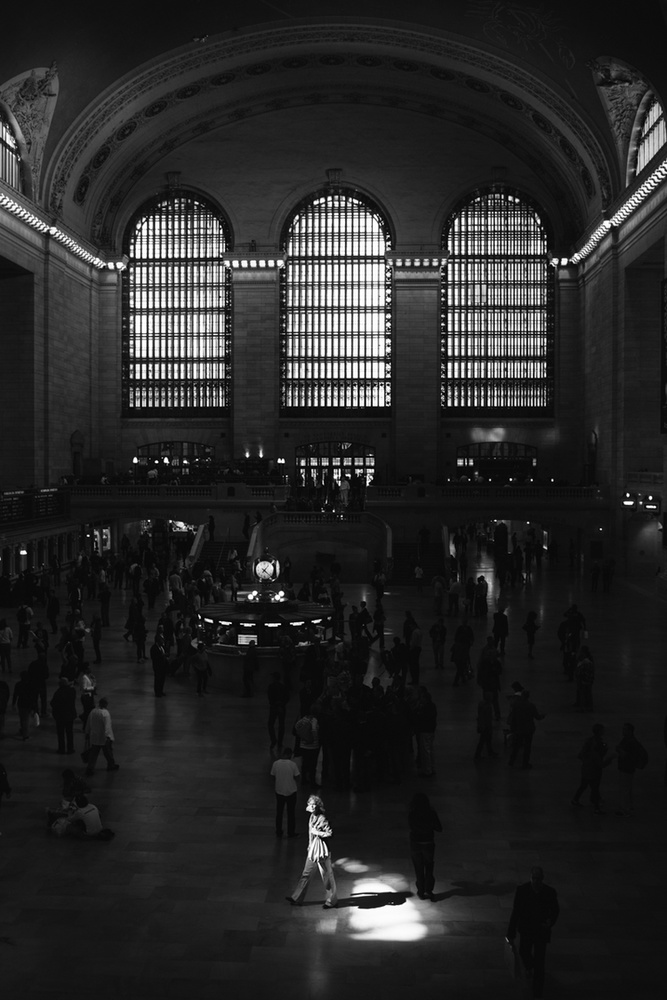
The Gestalt Principles or Gestaltism
Gestalt Psychology, (Gestalt directly translated means “shape” or “form”) was developed by German psychologists in the 1920’s and founded on the belief that the mind uses self-organizing tendencies to form a “global whole.” Basically, these theories try to explain how we perceived things and organize them in our brain. You’re probably already aware of many of these and didn’t even know it. Some of these principles are similar and directly relate to one another.
 Figure/Ground – As our brains take in and process
constant visual stimulation, we will almost always tend to differentiate
a form from its surroundings. The subject, in our mind’s eye, is known
as the figure, and the surrounding area is known as the ground. This is
the most basic compositional device.
Figure/Ground – As our brains take in and process
constant visual stimulation, we will almost always tend to differentiate
a form from its surroundings. The subject, in our mind’s eye, is known
as the figure, and the surrounding area is known as the ground. This is
the most basic compositional device.
 Our perception of the figure can depend on multiple characteristics
including color or contrast. “The Vase” by Edgar Rubin is the most well
known example of Figure/Ground. Learning to control your definition of
figure and ground in your photos will allow you greater control of the
viewer’s perception of the subject matter and the negative space around
it.
Our perception of the figure can depend on multiple characteristics
including color or contrast. “The Vase” by Edgar Rubin is the most well
known example of Figure/Ground. Learning to control your definition of
figure and ground in your photos will allow you greater control of the
viewer’s perception of the subject matter and the negative space around
it.
A strong grasp on this concept, and you’ll no longer need to shoot at a wide aperture to create separation of your subject to the background. When presented with a busier background, look for the part of the background that gives the best contrast to the subject.

 Sometimes color can be used to create separation. This is a great
time to use complimentary colors. Common pairs are red/green,
blue/orange and yellow/purple. A bolder color will come to the forefront
of your image, and a lighter or less saturated element will recede.
Sometimes color can be used to create separation. This is a great
time to use complimentary colors. Common pairs are red/green,
blue/orange and yellow/purple. A bolder color will come to the forefront
of your image, and a lighter or less saturated element will recede.
 Chiaroscuro and negative space also fall under the
principle of “Figure/Ground.” Chiaroscuro, while sounding like a Mexican
dessert, is the art of using strong contrasts between light and dark to
affect the composition. Darkness helps to define the light in the same
way that negative space helps to define the subject. Enhancing contrast
has the power to enhance the illusion of depth.
Chiaroscuro and negative space also fall under the
principle of “Figure/Ground.” Chiaroscuro, while sounding like a Mexican
dessert, is the art of using strong contrasts between light and dark to
affect the composition. Darkness helps to define the light in the same
way that negative space helps to define the subject. Enhancing contrast
has the power to enhance the illusion of depth.


 The concept of negative space expands on the principle of the
“ground.” When focusing on negative space, the space around the subject
makes a great impact on defining the subject itself, while giving the
eye a “place to rest.” In photography, negative space oftentimes
produces a silhouette, drawing attention to the subject, or positive space.
The concept of negative space expands on the principle of the
“ground.” When focusing on negative space, the space around the subject
makes a great impact on defining the subject itself, while giving the
eye a “place to rest.” In photography, negative space oftentimes
produces a silhouette, drawing attention to the subject, or positive space.
Proximity and Grouping – When elements are placed close together, they are perceived as a group. When similar objects are placed together, they are perceived as a whole. This builds on the Figure/Ground principle.
 Individually, these are just birds (separate shapes). When they are together, they are seen as one group.

 It’s important to keep the principle of proximity in mind when
composing. Otherwise, if we forget this (along with Figure/Ground),
background objects (like people) can grow out of people.
It’s important to keep the principle of proximity in mind when
composing. Otherwise, if we forget this (along with Figure/Ground),
background objects (like people) can grow out of people.
 Symmetry and Balance – Symmetry in an image creates
equilibrium. Unfortunately, with the way our brains work, seeing
symmetry indirectly causes our brain to search for the break in
symmetry rather than appreciate the balance. Remember, symmetrical
composition can be boring, so it rests on the creator to find a way to
remedy this by creating even more dynamic shots (see Wes Anderson video
in Part One).
Symmetry and Balance – Symmetry in an image creates
equilibrium. Unfortunately, with the way our brains work, seeing
symmetry indirectly causes our brain to search for the break in
symmetry rather than appreciate the balance. Remember, symmetrical
composition can be boring, so it rests on the creator to find a way to
remedy this by creating even more dynamic shots (see Wes Anderson video
in Part One).
Balance does not always mean perfect symmetry. Most rules of composition exist to give balance – the Rule of Thirds, the Golden Triangle/Rectangle/Spiral. They all can be used to provide balance just as much as center composition - and sometimes they even do a better job...
 The image on the left uses center composition and feels cramped. By
simply offsetting an image, and using the Rule of Thirds, this image
becomes more visually interesting while being more balanced. Using the
principle Figure/Ground, both the monument (including its reflection)
and the couple with the umbrella occupy their own spaces in the image.
The image on the left uses center composition and feels cramped. By
simply offsetting an image, and using the Rule of Thirds, this image
becomes more visually interesting while being more balanced. Using the
principle Figure/Ground, both the monument (including its reflection)
and the couple with the umbrella occupy their own spaces in the image.
 Similarity - This builds on the Proximity/Grouping
principle. Elements that have similar characteristics will often be
viewed as a group or a pattern. The human brain is wired to recognize
patterns. Repetition, especially with slight variations (called
“anomalies”) can have a pleasing appearance.
Similarity - This builds on the Proximity/Grouping
principle. Elements that have similar characteristics will often be
viewed as a group or a pattern. The human brain is wired to recognize
patterns. Repetition, especially with slight variations (called
“anomalies”) can have a pleasing appearance.
 Continuity – This is when the viewer’s eye is compelled to move beyond an object and continue through it. Leading Lines falls
under this principle. The lines should be straight or curved, are not
always obvious and guide the viewer’s eye somewhere else in the image.
Continuity – This is when the viewer’s eye is compelled to move beyond an object and continue through it. Leading Lines falls
under this principle. The lines should be straight or curved, are not
always obvious and guide the viewer’s eye somewhere else in the image.
 This ideally creates a more fluid relationship between differing compositional elements.
Closure- Closure attempts to give the brain enough information so that it can form figures even if they aren’t entirely in frame. This is also known as “leaving a little to the imagination.” A closed shape can be boring, but if a subject isn’t completely in frame (and the mind finds it interesting), the brain will try to fill in the details. Degas was a master of this concept.
 This is closely related to Similarity and Continuity. The brain wants
to follow lines and contours even with the lines are not obvious or
complete. It is believed that this developed because of evolution –
being able to sense danger by perceiving predators from only small,
recognizable features.
This is closely related to Similarity and Continuity. The brain wants
to follow lines and contours even with the lines are not obvious or
complete. It is believed that this developed because of evolution –
being able to sense danger by perceiving predators from only small,
recognizable features.
 The Gestalt Principles are usually described using the phrase, “The
whole is other than the sum of its parts,” so using multiple principles
in an image will ultimately create a more dynamic use of space (There is
often a mistranslation of this phrase to “the whole is greater
than the sum of its parts,” but the Gestalt Principles importantly
allow for the individual visual characteristics to be broken down
separately). At the end of the day, the Gestalt Principles, like all
other compositional devices, are just tools to help guide us in making
good (hopefully great) compositions.
The Gestalt Principles are usually described using the phrase, “The
whole is other than the sum of its parts,” so using multiple principles
in an image will ultimately create a more dynamic use of space (There is
often a mistranslation of this phrase to “the whole is greater
than the sum of its parts,” but the Gestalt Principles importantly
allow for the individual visual characteristics to be broken down
separately). At the end of the day, the Gestalt Principles, like all
other compositional devices, are just tools to help guide us in making
good (hopefully great) compositions.
Conclusion
Eliminate the nonessential. Successful images have no dead space or inactive parts. Use a good foundation – the Rule of Thirds, the Golden Triangles, the Baroque Diagonals and the Golden Ratio are excellent places to start. Then build on that foundation using good visual theory.
All this, of course, only gets us part of the way there. Just because someone has created a compositionally perfect photo, does not mean that the photo is interesting. But by using these techniques and guides, you will hopefully be able to create better balance in yours.
Now that we’ve covered some of the more common rules/guidelines that are present in photography and painting, let’s move on to some of the more abstract concepts and theories including framing devices and the ways that our brain organizes how we see.
To frame something, we are giving the object some kind of physical presence. Our photos are always seen though frames. Sometimes the image is in a literal frame, and sometimes the frame is just the edge of the screen. Framing can help to add context, meaning or depth to a photo – especially when the framing device is related to the subject. Using something to frame another part of your image creates a more immediate sense of focus on your subject and adds a three-dimensional element to an otherwise flat scene.
The Gestalt Principles or Gestaltism
Gestalt Psychology, (Gestalt directly translated means “shape” or “form”) was developed by German psychologists in the 1920’s and founded on the belief that the mind uses self-organizing tendencies to form a “global whole.” Basically, these theories try to explain how we perceived things and organize them in our brain. You’re probably already aware of many of these and didn’t even know it. Some of these principles are similar and directly relate to one another.
A strong grasp on this concept, and you’ll no longer need to shoot at a wide aperture to create separation of your subject to the background. When presented with a busier background, look for the part of the background that gives the best contrast to the subject.
Dark subject? Find the light area of the background.
Light subject? Look for the dark area. It’s not magic. It’s just a bit of awareness and common sense.
Painters like Caravaggio and Rembrandt used this extensively.
Stanley Kubrick used it in the film "Barry Lyndon."
W. Eugene Smith
W. Eugene Smith, Garry Winogrand and Annie Leibovitz are considered to be modern masters of the Chiaroscuro.
Proximity and Grouping – When elements are placed close together, they are perceived as a group. When similar objects are placed together, they are perceived as a whole. This builds on the Figure/Ground principle.
Separately, they are Earth, Fire, Wind, Water and Heart. But when combined, they summon Captain Planet.
Facial symmetry is the foundation of classic definitions of beauty.
Balance does not always mean perfect symmetry. Most rules of composition exist to give balance – the Rule of Thirds, the Golden Triangle/Rectangle/Spiral. They all can be used to provide balance just as much as center composition - and sometimes they even do a better job...
Closure- Closure attempts to give the brain enough information so that it can form figures even if they aren’t entirely in frame. This is also known as “leaving a little to the imagination.” A closed shape can be boring, but if a subject isn’t completely in frame (and the mind finds it interesting), the brain will try to fill in the details. Degas was a master of this concept.
From the Gestalt Educational Program
Conclusion
Eliminate the nonessential. Successful images have no dead space or inactive parts. Use a good foundation – the Rule of Thirds, the Golden Triangles, the Baroque Diagonals and the Golden Ratio are excellent places to start. Then build on that foundation using good visual theory.
All this, of course, only gets us part of the way there. Just because someone has created a compositionally perfect photo, does not mean that the photo is interesting. But by using these techniques and guides, you will hopefully be able to create better balance in yours.


